Overview
Skillz has more than 5,000 games using their SDK to process payments and ensure fair competition between their players. The documentation plays a very important role in the expansion and growth of the company but has been the source of multiple complaints by game studios working with the company.
Objective
The aim of this project was to solve the problem of reading but also maintaining the documentation, while improving the overall experience of developers using our SDK.
My Role
Lead Product Designer
Interviews, Prototyping and User Testing.
Company
Skillz / Devex
The Problem
With thousands of game developers creating games in multiple operating systems (IOS, Android, Unity, JS) and in different languages, Skillz documentation grew disorganized and difficult to navigate.
This project was triggered by the constant complaints received by multiple developers integrating our SDK into their platform. This initial insight was expanded with qualitative research.
This problem directly impacted important business metrics, such as new developers and the release of new games, making it a big design priority for the company.
Challenges
- Documentation covers multiple operating systems (IOS, Android, Unity, JS).
- Our game developers create games in more than six different languages.
- Documentation needs to be maintained by low-tech employees.
- Documentation has multiple versions for each SDK major release.
User Research
Early Insight
The early insight was provided by hundreds of tickets raised by developers and by talking with people that have been involved with previous documentation initiatives. This early insight showed that developers normally use search engines (like Google) to search for help, but unfortunately Skillz documentation was not optimized for SEO. Big studios were not complaining that much because they were getting personalized help from Skillz Consumer Success department. While taking care of your big clients makes sense in the short term, it was leaving out the smaller game studios (self-service studios), and effectively preventing one of the biggest goals of the company: “wide adoption all across the game industry.”
Qualitative Interviews
- I have always enjoyed working with user researchers, and this time was no exception. I put together the interview script, and I was also part of the interview process.
- My objectives when creating the script were super clear. I wanted to understand:
- How the devs use the documentation.
- How the devs share it with other colleagues.
- “The Job to Be Done”—what tasks devs have to complete day-to-day, and how the documentation supports them in the process.
- How a successful user experience would look like, without inserting bias.
Insight
These are the most important things we learned after talking with customers:
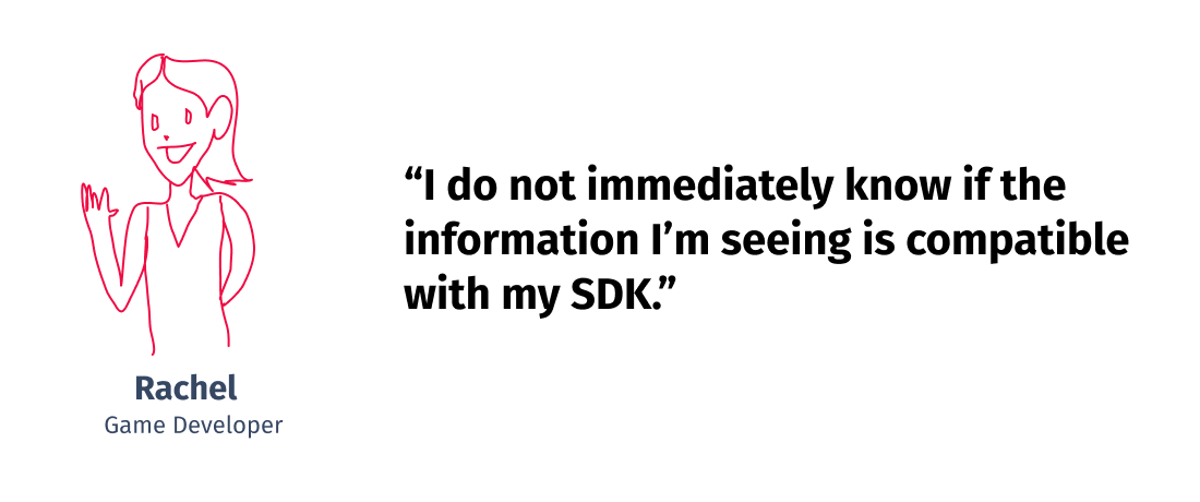
- ❌🤔 They do not immediately know if the information they are seeing is compatible with the SDK they are using. This makes document navigation difficult and challenging. More than once, customers have wasted development cycles trying to implement incompatible solutions.
- ❌⛵️ It’s a real struggle to navigate between the web app and the documentation, especially because every link opens in a new window/tab, and the page doesn’t remember which SDK version is being used.
- ❌🤖 The team have tried to use the conversational agent installed in the app, but it doesn’t answer anything correctly and always sends you back to the documentation.
- ❌🌎 The documentation in languages other than English is rarely updated, if ever at all.
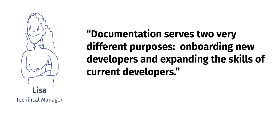
- ⚡️ Documentation serves two very different purposes: the first is onboarding new developers to the SDK and the platform; the second is expanding the skills of current developers, including debugging.
I was especially surprised by the last point. While obvious in retrospect, realizing that documentation falls into two big categories (onboarding and expansion of knowledge) was one of the most important discoveries of this initial research.
User Profile
The research made clear that the same user (the developer) would use the app differently based on her current situation. Knowing this, I categorized all the possible situations into three user profiles based on their goals and tasks.
- Backend Engineer | Bachelor CS | Understands English, other languages.
- Uses: Visual Studio Code, Github, Discord, Telegram, Stack Overflow.
- Tasks Performed:
- Installing Skillz SDK on a game for the first time.
- Learning the foundational skills around the SDK.
- Pain points:
- Backend Engineer | Bachelor CS | Understands English, other languages.
- Uses: Visual Studio Code, Github, Discord, Telegram, Stack Overflow.
- Tasks Performed:
- Debugging is the bulk of her work
- Upgrading SDK
- Troubleshooting customers
- Pain points:
- Backend Engineer | Bachelor CS | Understands English, other languages.
- Uses: Visual Studio Code, Github, Discord, Telegram, Stack Overflow.
- Tasks Performed:
- Installing new features to her game.
- Improving current skills.
- Getting certified.
- Pain points:
Iterations
Starting at the End
After talking with my product manager and stakeholder, I made the case that it would be really useful if we spend some time imagining what the best possible user experience would look like. And that’s how the following “Dream User Journey” came to be. It was an exercise mostly based on the scenarios gathered from the first qualitative research findings.
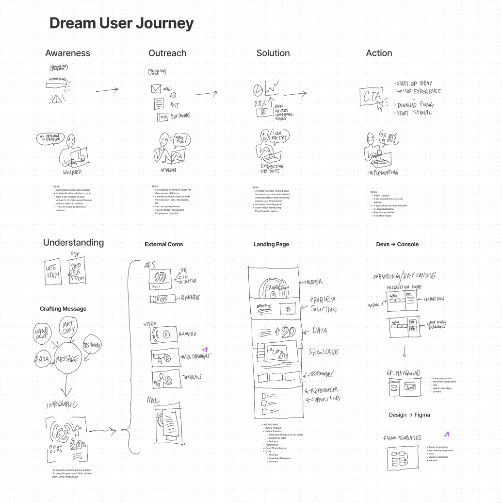
This journey shows a very proactive system that is smart enough to understand the user situation and raise awareness before it is too late. It also provides the developer with solutions using different channels, and proposes one that would make sense for her current situation. It’s a smart and proactive documentation that also encourages the developer to acquire new skills and improve her app.
Wireframe Time!!
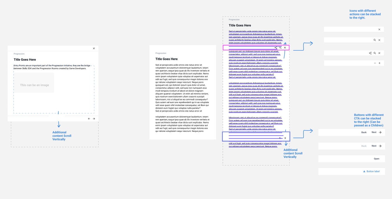
I talked with engineers super early in the process to check on the feasibility of an idea that was brewing in my head. This idea was to bring the documentation directly into the app. After being cleared by devs, the product manager and stakeholders, I developed the wireframes and started usability testing immediately.
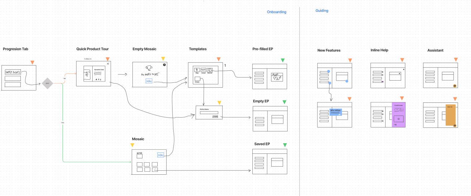
The first round was not that polished visually, but it showed the user flows that I was testing.
Usability Testing
I prefer moving to high-fidelity prototypes as soon as possible because they have a more realistic impact than regular wireframes during testing. Users also allow us to get an accurate feel for the app.
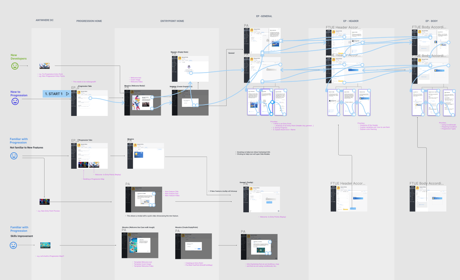
Rapid high-fidelity prototyping was allowed by a strong design system in Figma, with multiple components ready to go.
The Solution
1. In Context Help
Information where you need it.
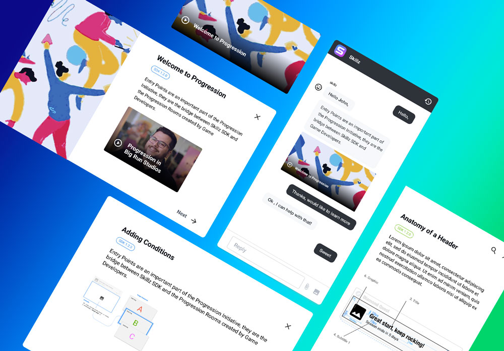
One of the most important changes on the new design was to move the documentation inside the app. This would facilitate the delivery of the piece of information at the exact time and place the user needs it. It would also allow the app to understand who the user is, preferred language, etc.
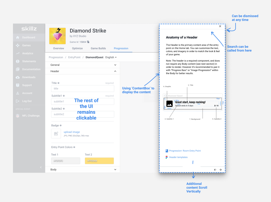
This shows how the documentation looks within the app.
2. Proactive Help
Smaller bits of help delivered on time and with a clear CTA
A very important improvement that I introduced was a clear and actionable CTA for every button, modal and UI element. This was especially important because just-in-time help would show up in the form of tooltips and other layovers.
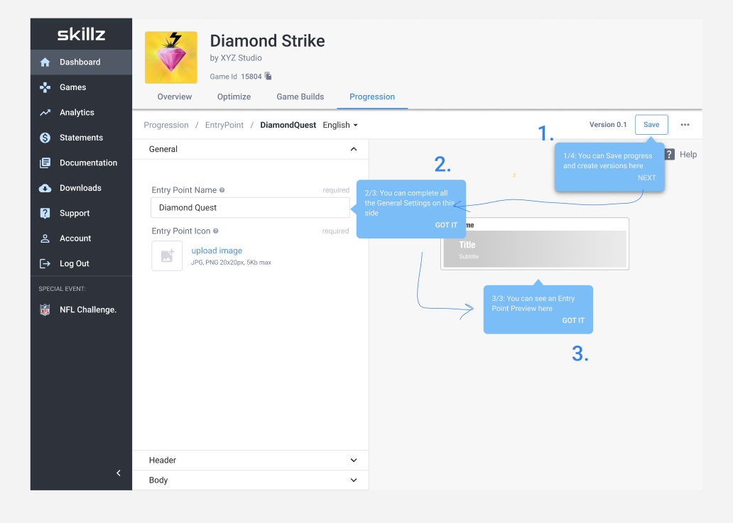
Every micro-copy explains status and defines next steps in simple and non-technical language.
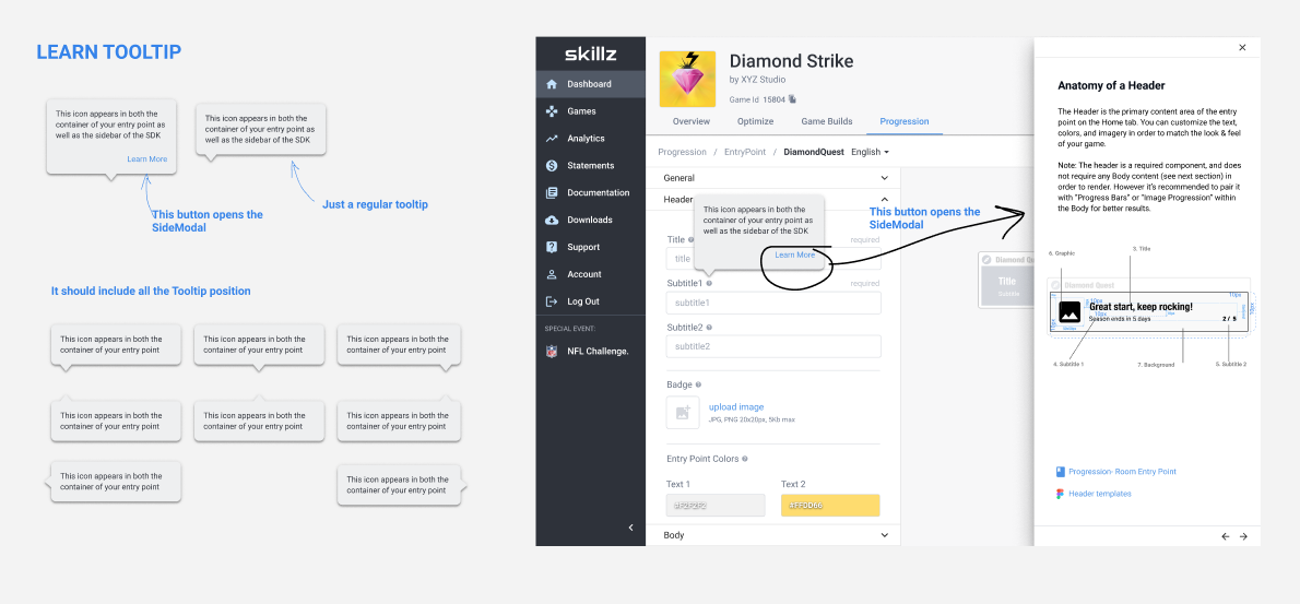
Tooltips can trigger more complex documentation (when available).
3. ML Powered Search
The right information, easy.
One of the biggest problems of the previous documentation was the search. I designed a flow that clearly communicated the status of the search, even when there were no results, and provided recommendations based on your context. This means that the app would always try to understand what you were trying to achieve, displaying related help accordingly.
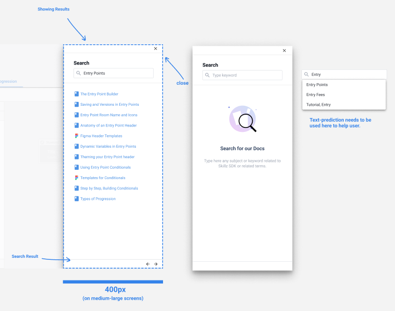
Search is currently keyword based, but it was designed to work along an intent-entity based ML model that captures utterances and improves answer accuracy over time.
4. Cross-Platform
Documentation that reaches you wherever you are.
A big challenge that I faced while designing this project was to make it cross-platform and easily connect to the multiple channels used by the company for customer support (Slack, chatbots, regular docs, email, etc.). This meant that every bit of information needed to be displayed on different devices, in different UIs while being accessible to all our users.
5. Accessible
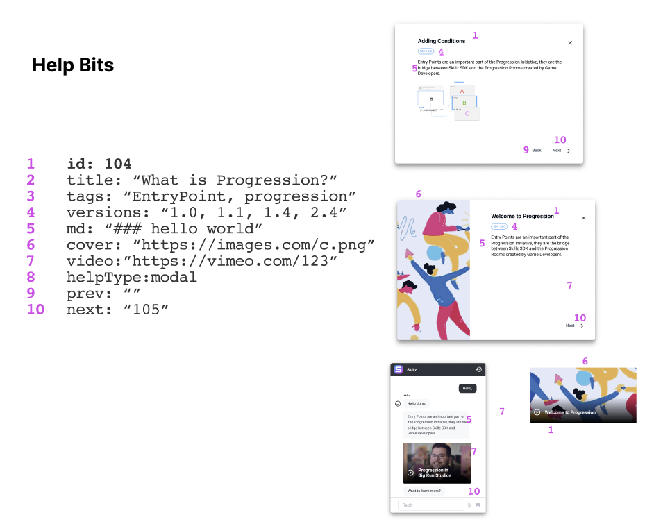
To solve this, I worked closely with the engineers of the team. Together we came up with an elegant and ingenious way of storing every bit of information into something we called “The Help Bits.”
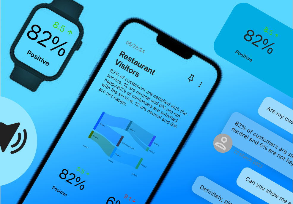
Keeping things UI agnostic allow us to adapt to the user accessibility requirements. This way help can turn into visual aid with big fonts or an audible explanation.
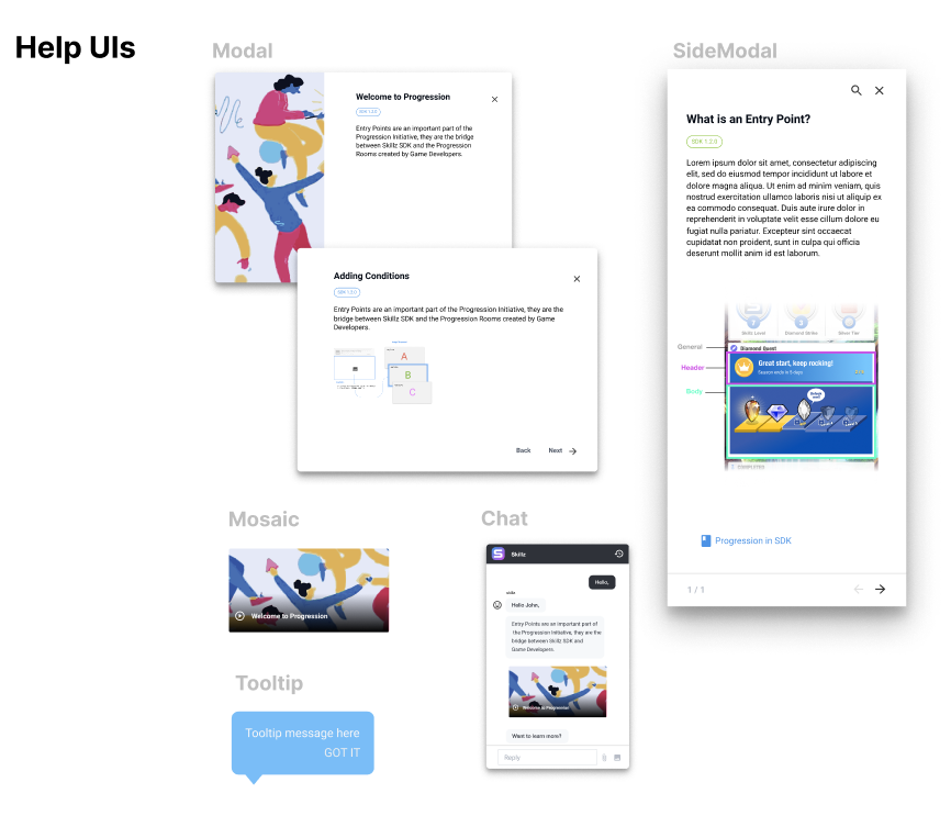
Any bit of information can manifest to the user in the form of a tooltip, a chat bubble or even an audible help, making this project accessible to people that cannot read a screen.
No-code tool for Maintainers
The last part of the puzzle (not shown here because I didn’t participate in it) was to enable content creators to update and translate the documentation. The team decided to use a CMS+API third-party solution to update the different versions and languages of the documentation. This worked flawlessly with the HelpBits JSON objects.
The Handoff
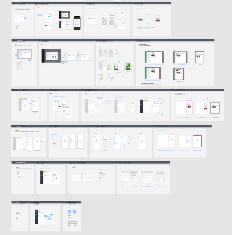
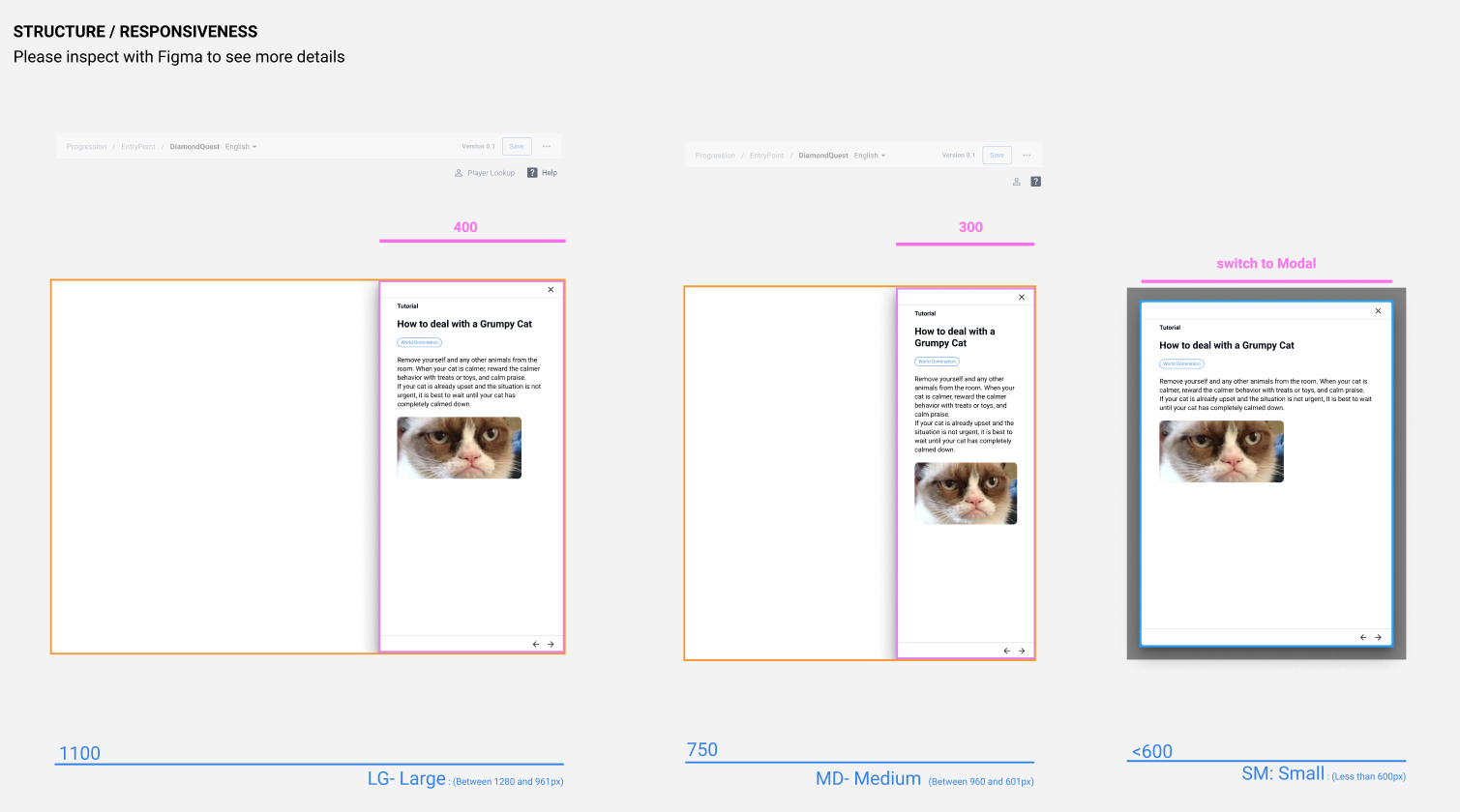
When everything was finally user tested and adjusted, I was also in charge of generating the handoff documents. I normally do this in Figma where I continue having conversations with engineers, all the way to project release. In these obsessively detailed files, I specify every user interaction, responsiveness, and also provide context to the developer so he understands why some decisions were taken.
Results
- This project is tied to one of the most important growth metrics in the company: Active Self-Service Developers. We will be tracking actions that start in the documentation and completed flows.
- The first phase of this project is being rolled out as I write this. I will update this case study with more extensive results as I learn more about them.
Project Learning
- Ambitious projects like this need to be divided into phases to manage expectations correctly.
- There’s a trove of user feedback in tickets and previous customer feedback. Disregarding all this for new research is missing a very important opportunity to understand users at their most sincere and sometimes vulnerable moments.
- Involving engineers early in the process not only makes the project 10x better, but also saves an incredible amount of time.
My Role
Lead Product Designer
UI Design, Prototyping, Testing
Company
Amelia R&D
Abstract
Chatbot development, especially rich-content features, were normally maintained by developers because they required coding skills. But this was not a sustainable strategy for companies that constantly need to push fresh content for their customers. The aim of this project was to design a no-code tool that enables content creators, like writers and visual designers, to create and maintain chatbots with ease.
The Problem
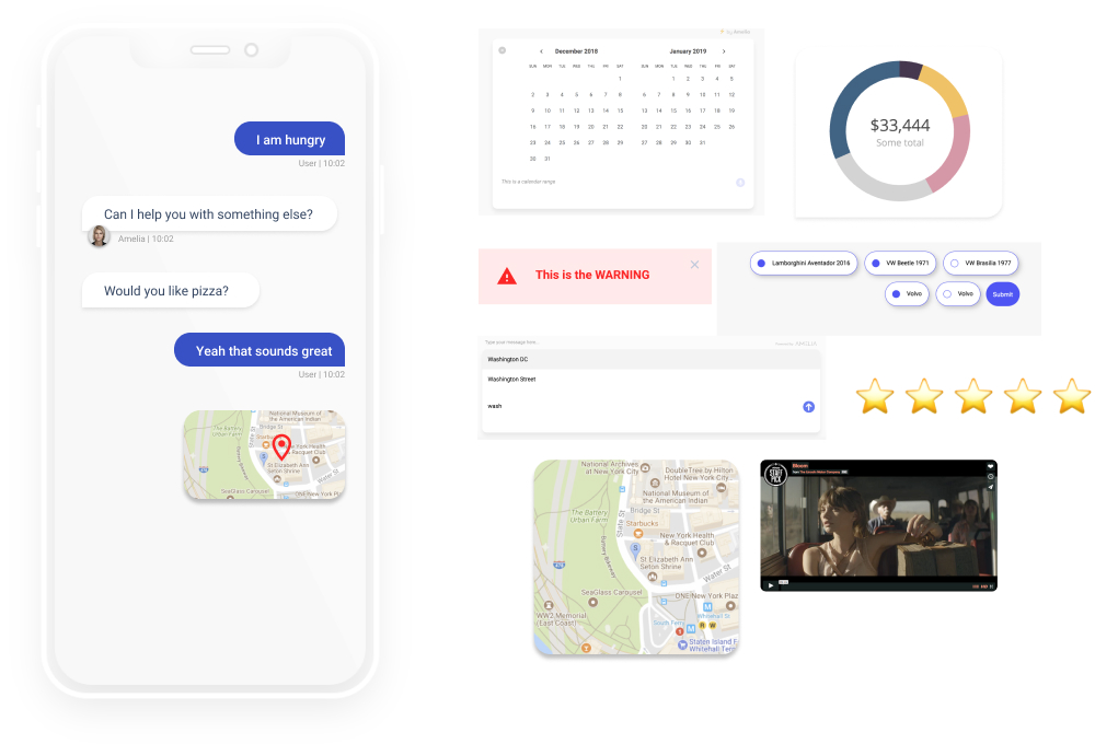
Amelia is a chatbot platform that helps companies create engaging conversational experiences for their customers. Most of their customers are financial and insurance institutions that distribute content in platforms like Alexa, DialogFlow (Google), Watson and others.
The big problem is that to generate these widgets in Amelia, users need to know how to code; and content creators such as copywriters and visual designers don’t code.
Challenges
- We are designing for multiple platforms, so this needs to be taken into consideration.
- We cannot expect users to be tech savvy, so we need to consider people with minimal internet skills.
Research
Early Insight
After talking with the stakeholders, project managers (PMs) and people close to this app, they communicated that adoption is being blocked because there isn’t an easy way to generate rich-content in the conversations. They also expressed frustration because, while Amelia started innovating with this type of technology years ago, the competition is growing very fast since they implement solutions that don’t require the user to code. I also learned that some internal tooling has been developed for some of the widgets, but it is very basic and only exports to one type of chatbot platform (Alexa).
Qualitative Interviews
I initially conducted interviews with engineers in charge of implementing chatbots. I also had the opportunity to talk with managers and content creators in companies using Amelia. What I gathered was very eye-opening and learned the following:
Insights
- When something needs to get updated, content creators need to send the new content to the developers so they can generate the code and upload it into the system. Even a single comma change requires them to start the process all over again. The engineers are effectively the CMS of the company.
- Uploading and updating content is not only a frustrating task for engineers, but it is also detrimental to their productivity because they cannot use their time to improve other features.
- The developers also struggle with explaining to new employees how things work; this is due to some lack of documentation. But even if this gets fixed, the system needs to be more self-service than what it is right now.
- Content creators feel very constrained within what they can do. They feel that they are not contributing with great content and that they are also unclear about the possibilities available for them to explore (video, calendars, photo galleries, etc.)
User Profile
The research showed that we have two very different sets of users. On one hand, the highly technical developers use code IDEs like Visual Studio Code and Github, and content creators are familiar with easy to use platforms like Wordpress, Twitter and Facebook.
👩 Developers
- Cognitive Engineer | Bachelor in Computer Science (or equivalent).
- Uses: Visual Studio Code, Github, Stack Overflow, XCode, Documentation.
- Tasks Performed:
- Defining intents and entities that will train the ML model.
- Upgrading and troubleshooting chatbot.
- Hand-coding chatbot-rich interactions (like a map).
- Biggest Pain:
👨🦰 Content Creators
- Conversational Designer | Marketing, Design.
- Uses: Adobe Suite, Twitter, Wordpress, Facebook.
- Tasks Performed:
- Generating new answers for chatbots.
- Designing rich experiences for the final user.
- Translating content.
Iterations
Around the same time that I was working on this project, I went to an OnDeck pitching contest where the only condition was to use “no-code” tools to prepare a working solution to a problem. I remember being absolutely floored by the quality of the projects I saw. The creators of these projects showed how anyone, technical or not, with the right set of tools can build great ideas.
And that’s how I pitched my idea to the PM and the team. Instead of making content creators more tech proficient, why don’t we make our app do the heavy lifting of generating the code, and let users do what they do best—create great content.
Wireframes
The first task was to understand the ‘work-to-be-done' of this new tool. I worked closely with engineers to make a list of all the types of interactions Amelia can have with the user and that can be generated with code. In total, we discovered 15 possible working interactions.
Users told us in research studies that sometimes they couldn’t find the interactions they wanted. We knew we had to think bigger. It was not only about finding the existing solutions, but also time to think about completely new possibilities.
Simplifying
My first iterations were focused on making things easier for content creators. I based my original idea on the ‘preview mode’ you see in other design applications. I removed all the technical jargon and included features like live preview and sharing.
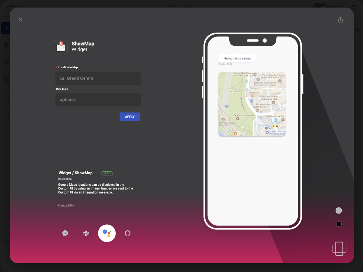
The problem was that when I tested this version with users, they had difficulties achieving the most basic tasks. That’s when I realized that maybe I went a little bit too far with the friendliness—I made it a little bit too basic. I first tried to add more complexity to this idea, but I ended up scrapping it completely.
The Solution
I arrived at the final solution after several iterations and dead ends. But what made this one work is that it had a balanced mix between complexity and ease of use. The design allows newcomers and technical people to get things done faster, and it uses flows that the user is already familiar with.
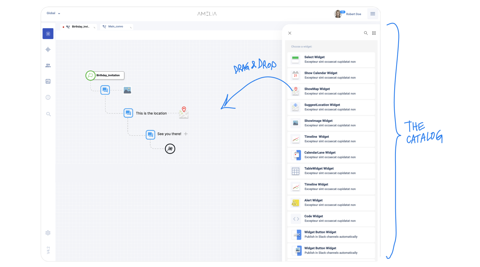
1. The Catalog
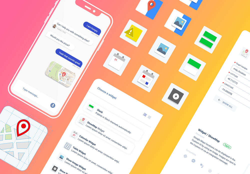
This is a drawer that shows all the available interactions (we called them widgets). Items can be dragged and dropped into the BPN designer flow. This catalog includes search and recommendations for the user.
2. The Editor + Preview
The widget editor was user-tested several times. It has everything a user needs to create rich content for chatbots, but at the same time includes some important technical aspects like in-context documentation, a compatibility matrix and a way to preview the generated UI.
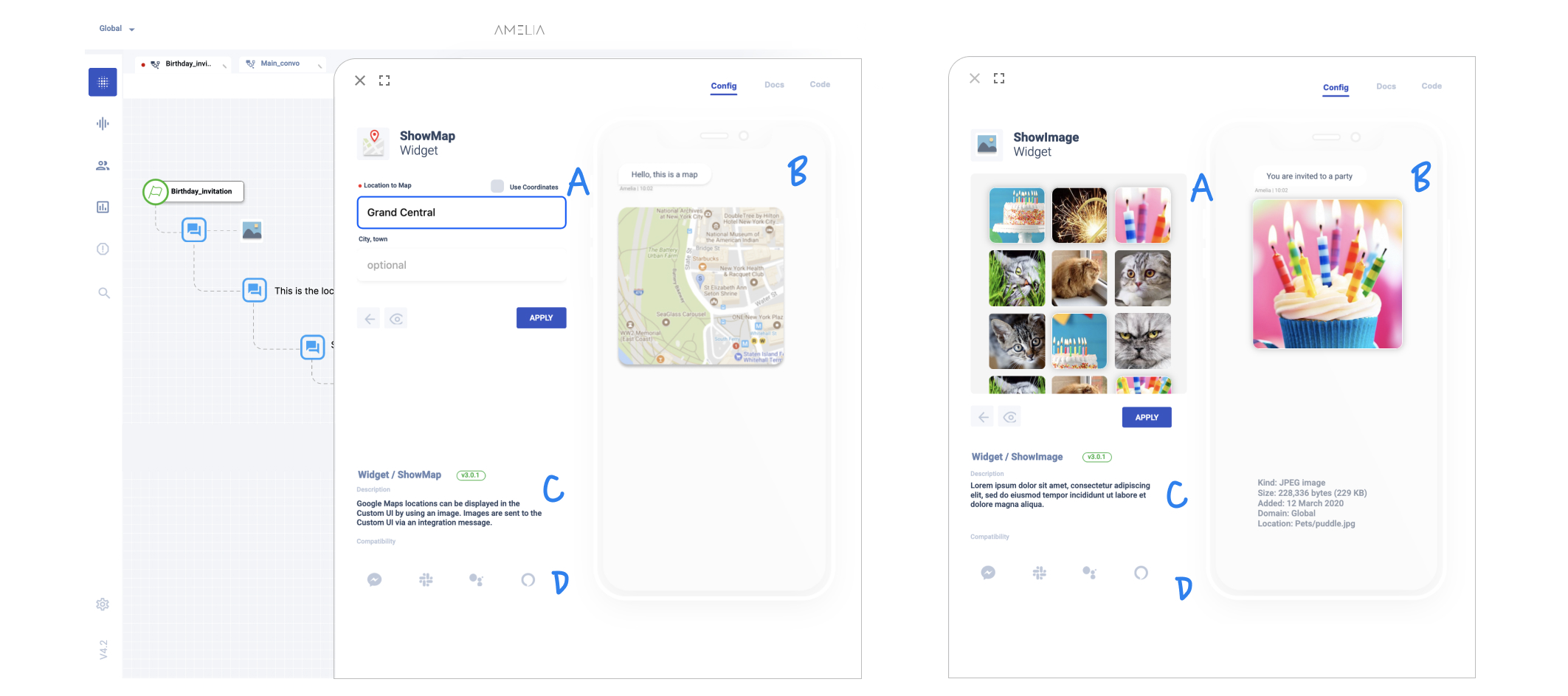
The biggest challenge for this design was to make it uniform across multiple widgets.
The preview provided the ability to preview changes in real time. This aligns with any design tool in the market and it was one of the most common requests from our users.
3. In-context Docs
Moving the documentation inside the app allowed us to deliver the right information, improving retention and onboarding of new users. The team created short versions of the documentation, explaining what each widget does and how to configure it correctly.
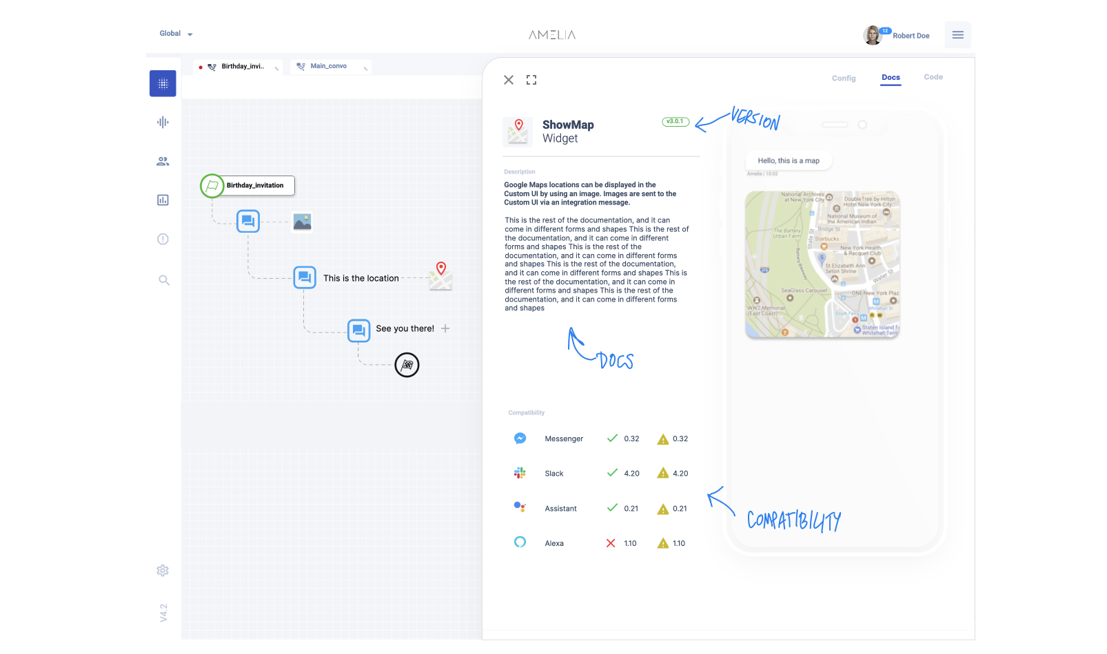
Amelia exports their conversations to multiple chatbot and conversational platforms. However, some of the features offered are not available everywhere. The compatibility table helps you understand which widgets are more adequate for the audience you are trying to reach.
4. Code Editor
One of the most important features of this redesign was not planned initially, but it came up after talking with the cognitive engineers. They explained how the current system doesn’t have templates that allow them to save code snippets to be re-used in different projects. They explained how every time they create a new chatbot using code, they need to copy and paste it from notepads or other repositories. While content creators don’t care too much for this feature, it’s being used by engineers as a template system.
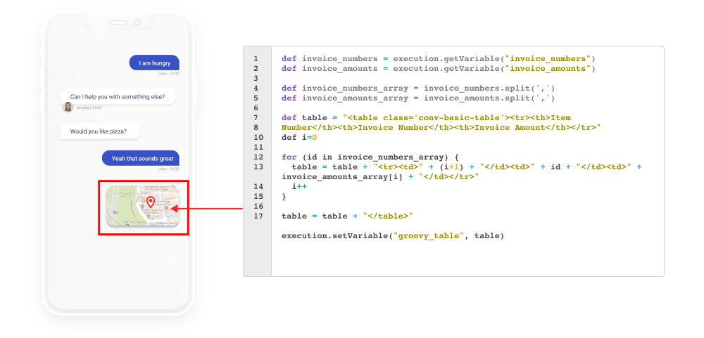
This no-code tool allows engineers to customize the widget and propel further customization.
Results
This no-code tool was first released internally and then later to big customers. We continued making interviews and observing the data to make informed decisions.
- 12 new enterprise customers (finance and insurance institutions with millions of customers).
- 1.5k content creators onboarded.
- ~40k new interactions generated.
Project Learning
It’s normal to discover new ideas along the way. These ideas are very important, especially if they are coming from conversations with the user. The team needs to be flexible and approach these as opportunities and not as deviations. It is also important to set a clear scope, drawing a line between the nice-to-haves and the useful ideas that impact our business metrics.
No-code tools are here to stay and are the best way to empower people that normally would not create an app or conversational agent. They also help engineers to focus on other things.
The introduction of new design paradigms need to be done carefully. Users will always prefer familiarity over new ways of doing things. The best way to create new things is to include some familiar components that will guide the initial user reaction.
1. The Problem
Design systems are an excellent tool for maintaining consistency across multiple apps and screens. They enhance collaboration between teams by offering a shared framework for design and development, reducing misunderstandings and improving communication. This leads to stronger teamwork and better outcomes. Today’s design systems are an evolution of traditional branding guidelines, encompassing typography, color palettes, layout, visual image style, and proper logo usage.
The last major shift in design systems occurred with the introduction of mobile devices, which brought about a new paradigm that required the industry to rethink layouts and information presentation. Today, we're experiencing a similar transformation with the rise of conversational systems.
2. Insight
Over the past decade, we've collaborated with numerous companies using chat and voice-first systems, and we've recognized the need to radically reinvent our approach to human-user interfaces. While the primary goal—defining guidelines for product and design teams—remains the same, the way we conceptualize design system taxonomy must be entirely reimagined.
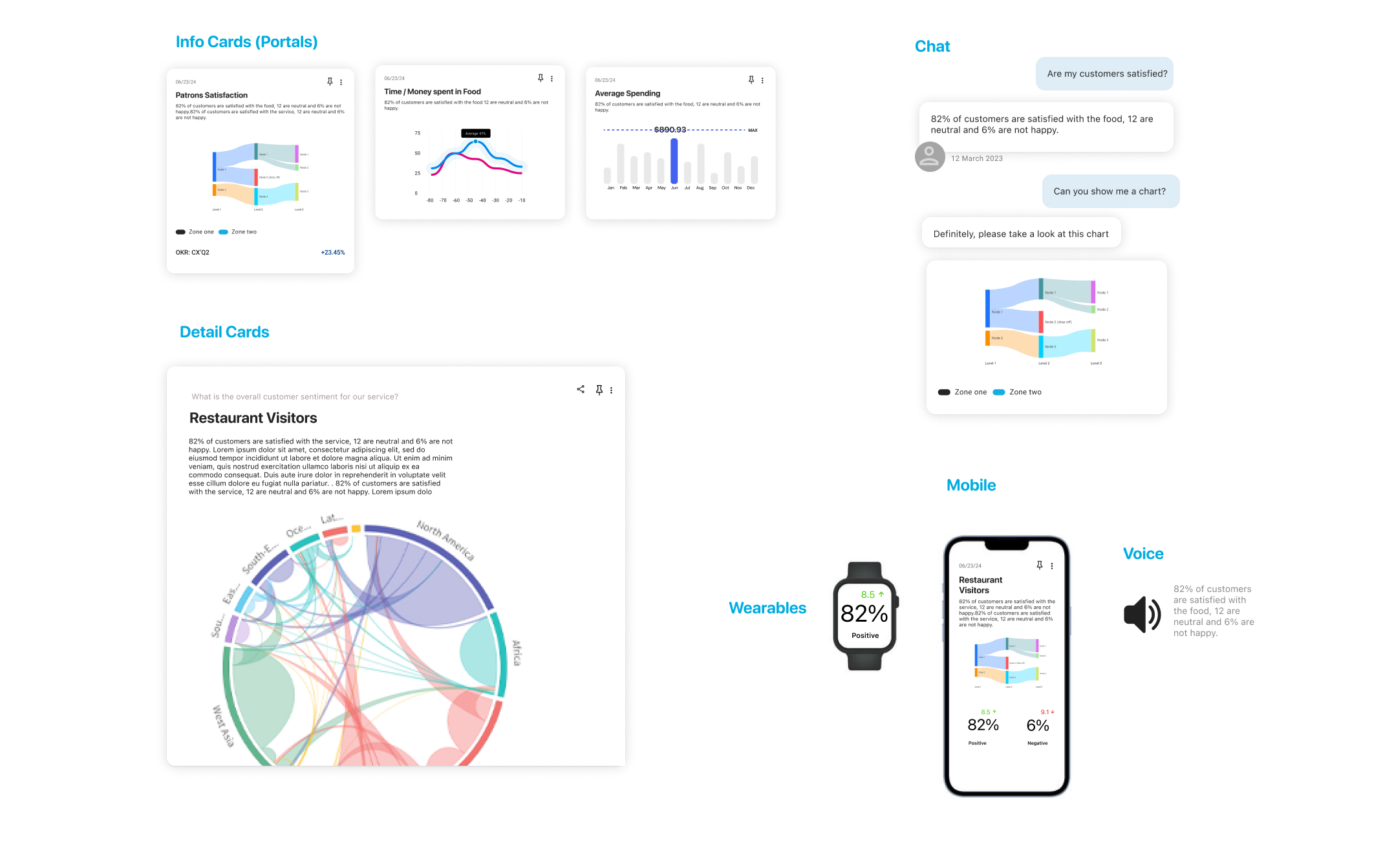
Unlike a traditional design system that focuses solely on screen-based user interfaces, a conversational design system (CDS) defines how interactions unfold across multiple platforms, where screens are no longer the primary focus. Here are the key concepts driving a conversational design system.
3. Core principles
Cross platform HUI.
While traditional design systems rely solely on graphical user interfaces (GUI), a conversational design system (CDS) integrates user interfaces from various platforms, including sounds, voice tones, 3D objects, gestures, and haptic feedback
Cross-platform HUIs (Human-User Interfaces) are guided by the user’s intent and the platform they are using to interact with the system. For instance, a voice command might be used to notify someone while they’re driving, whereas the same notification could appear as a subtle pop-up when they’re using a headset.
The conversational design system ensures consistency across platforms, even when different HUIs are used to communicate with various users.
HUI cross-platform components are also shaped by context and priority. For example, a simple notification might begin as a quiet beep but can escalate to a visual alert with loud sounds
Platform Agnostic.
Unlike traditional design systems where the UI elements (like buttons and text inputs) can be pre-arranged in a layout, a conversational design system is dynamically generated during interactions with the user.
The output data payloads that power CDS components must be platform-agnostic, as we can't predict in advance which UI will be used to reach the end user.
Another reason the payload driving CDS needs to be platform-agnostic is that it may attempt various methods to interact with the user until the interaction is completed. This means it could cycle through multiple HUIs across different platforms to reach the user.
Flexible but consistent.
One of the key advantages of a CDS is its ability to ensure consistency across diverse platforms. Similar to traditional systems, "design tokens" are used to define the fundamental elements of interactions. For visual components, the team will establish guidelines for colors, typography, and overall style. For auditory interactions, they will define sounds, alerts, and voice cues. For gestures, the team can choose between sharp, strong, or delicate interactions, among other options.
When multiple HUIs are equally valid, the designer and development team can specify preferred interactions, allowing the developer to guide the experience. These settings can also be overridden by user preferences, where the preferred mode of interaction is defined by the user.
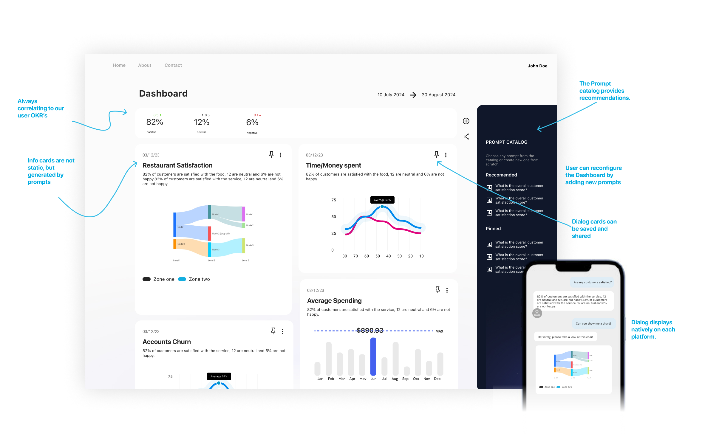
A Conversational Design System is not just shrinking or expanding UI, it selects the best UI for each platform and device.
Accessible.
Accessibility is a priority and must be personalized because everyone's needs are different. For example, visually impaired individuals require specific accessibility features, while those with hearing impairments need different types of responses. A CDS must be capable of recognizing these unique needs and delivering responses that ensure effective and high-quality interactions for everyone.
Accessibility also entails that the CDS provides responses in a language the user can understand. All CDS components should be capable of displaying information in any alphabet, and voices should be clear in any spoken language.
Implementation Details.
The CDS delivers predictable outcomes with specific data structures while remaining flexible enough to summarize and present content across various HUIs.
The CDL is designed to work with an AI that processes requests and generates correctly formatted payloads. In other words, LLMs and prompting handle the heavy lifting of preparing data for the CDS
The CDS leverages a range of technologies to interact with users, from voice and animated 3D to basic text messages. Importantly, it can seamlessly fall back to text messages if needed, ensuring that interactions remain uninterrupted.
My Role
Lead Product Designer
Interviews, Prototyping, Testing
Company
Amelia R&D
Context (What is Amelia?)
Amelia is a conversational agent focused on creating the most human chat agent in the market. The technology behind it is indeed impressive. When correctly trained, it can achieve an impressive 80-90 percent accuracy.
Amelia uses different machine learning models to understand user intent and return a correct answer. Each one of these models needs to be trained with different types of data. For example, some of the models require Q&A pairs, while others can digest big blocks of text. Equally, some of these models are fine-tuned to respond to human small talk (e.g., How are you doing?), while others are created to answer hard facts (distance to the moon).
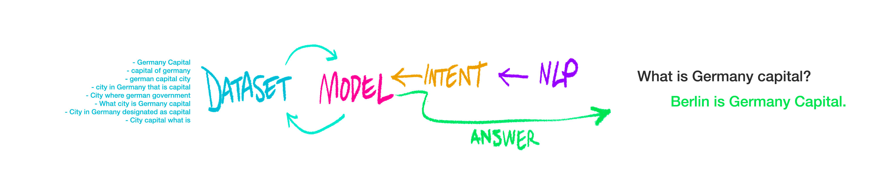
Arguably, datasets are even more important than models to generate good answers.
When Amelia receives an utterance from the user, all the trained models fire up and, depending on the question, some will return an answer with a confidence score between 0.0 and 1.0 (0.1 = not sure at all, 9.0 = very confident). This score is then processed by an arbitration algorithm that decides which answer to pass on to the user. All this happens in milliseconds, making it feel like the response was provided by a regular person.

Lack of Datasets
Like many ML-based systems, Amelia’s achilles heel has always been the training data required to train the models correctly. The tools used to achieve this are a constellation of smaller apps, each one of them focused on compiling different types of data and normally maintained by different teams. This creates a nightmare situation where it is impossible to have visibility over all of the training data. Another problem with having a lot of disperse tooling is that it blocks the team from selling Amelia to other companies interested in using it.
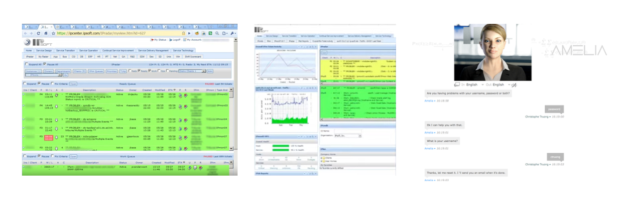
Usability was not taken into consideration in previous versions.
This realization caused Amelia leadership to start multiple, ambitious initiatives, including aligning all the micro-services, moving to the cloud, generating multiple SDKs and designing a consolidated training tool. For this last one, I was fortunate to participate as the lead UX.
Challenges
- Consolidate multiple apps in one easy to use training tool.
- Design an easy to use search that can be used across all systems.
- Work with multiple teams, especially with ML engineers, to create the best possible solution.
Research
Qualitative Interviews
The first round of interviews I did was with stakeholders, data scientists, conversational designers and engineers. I wanted to be extremely familiar with the problem before starting to sketch any solution.
My research objectives were:
- To understand the subsystems that encompass Amelia.
- To define a hierarchy for all the tasks to be done.
- To understand the users’ backgrounds and what tools they are familiar with.
- To define the success metrics for each task.
Insight
The early insight showed that:
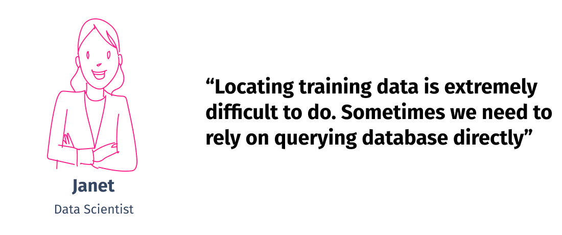
- ❌🔍 Locating training data is extremely difficult to achieve. Sometimes engineers need to rely on querying database directly (not scalable).
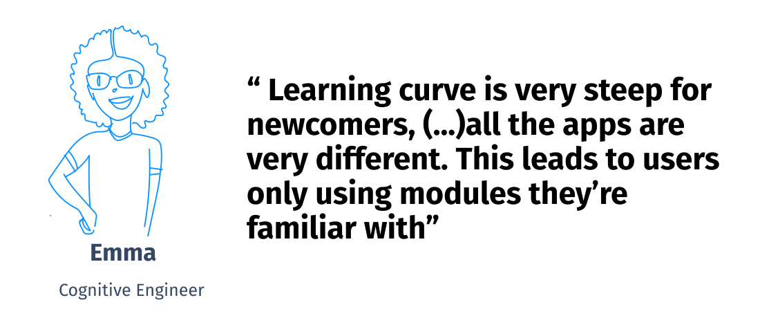
- ❌ ⚡ The learning curve is very steep for newcomers, especially because all the apps are very different. This leads to users only using modules they are familiar with, but not learning new ones.
- ❌📔 The documentation is practically nonexistent—only some loose docs that engineers pass around.
- 👀 External collaborators (e.g., Mechanical Turk) are very common, making it important to limit access with roles.
User Profiles
- Computer Science, Mathematics
- Uses: VSC, Kaggle, Tensor Flow, Jupyter.
- Tasks:
- Fine-tuning ML with existing datasets, designing challenges for data validators, running experiments.
- Pain points:
- Computer Science, Engineer
- Uses: Github, Visual Studio Code, Jira, Terminal.
- Tasks:
- Maintaining the apps running Amelia, creating backups and deploying new trained models.
- Troubleshoot users and help data scientists with tooling.
- Pain points:

- Any Bachelor’s Degree
- Uses: Chrome, Office, Social Media.
- Tasks:
- Participating in experiments as the ‘human in the loop,’ going through big datasets and helping with the disambiguation of data.
- Pain points:
Iterations
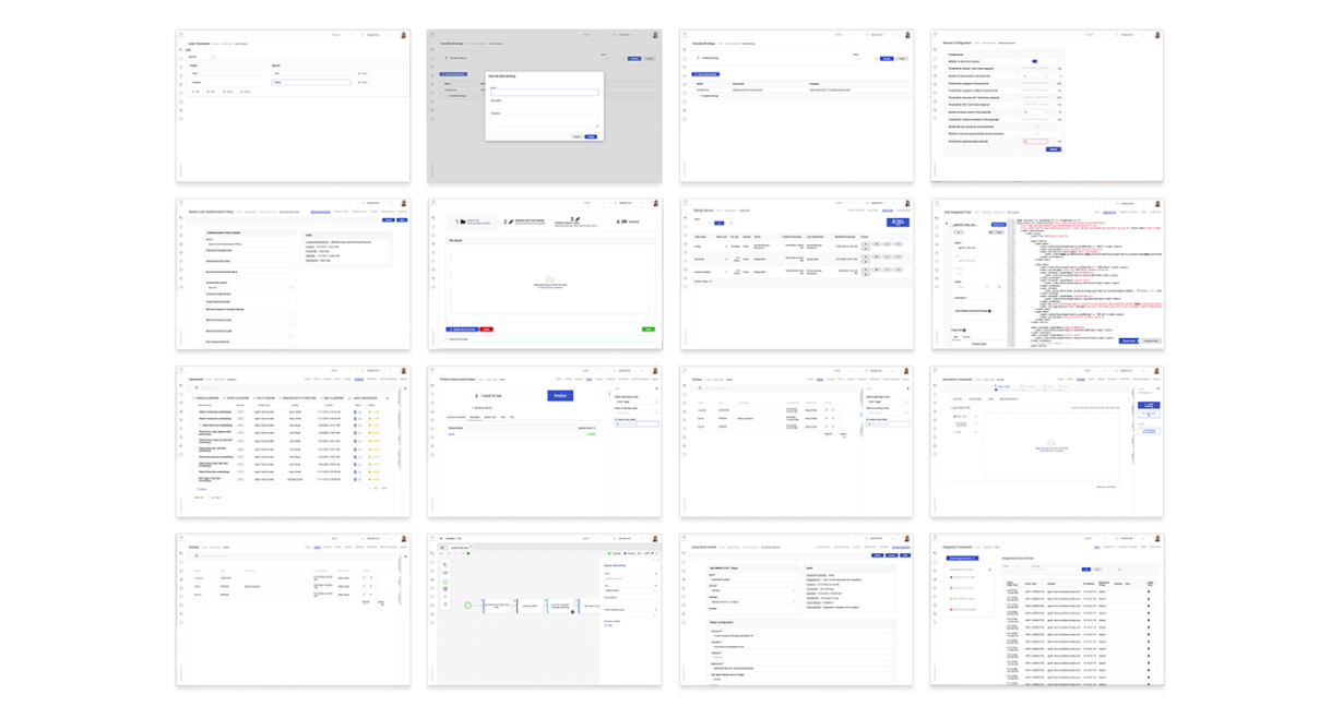
I first printed all the screens on good, old-fashioned paper and pinned them to the wall. The only thing that unified them was the UI style, but they all looked like completely different applications. It was clear that every app was conceptualized separately by different teams.
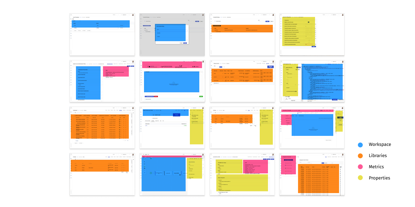
It was also evident that they all shared things in common. For example, they all had libraries, a section for properties, metrics and a workspace to do most of the work.
I recalled an article about the 30-year IDE evolution and how Visual Studio Code was the pinnacle of dozens of experiments about the best way to organize code.
Training models for machine learning are certainly not the same as writing code for a programming language, but these two paradigms have a lot of things in common. They both share assets and also need to handle code and parameters. Modern IDEs can provide us with valuable hints on how to deal with this complexity from a design point of view.
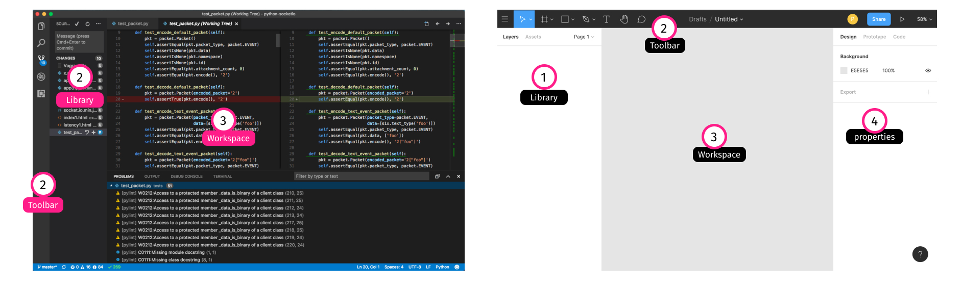
Visual Studio Code, IntelliJ, Eclipse, Atom, Xcode and other IDEs share common traits.
The Solution
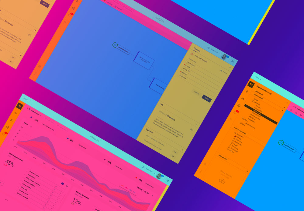
After getting the project manager and stakeholder to greenlight the IDE idea, my mission was to design something that was easy to use, but overall make all of our users productive under the same interface. To be sure about this, we conducted several usability tests before landing on a version that had a good balance between usability and complexity. This final solution included four main blocks: Library, Tools, Workspace and Properties.
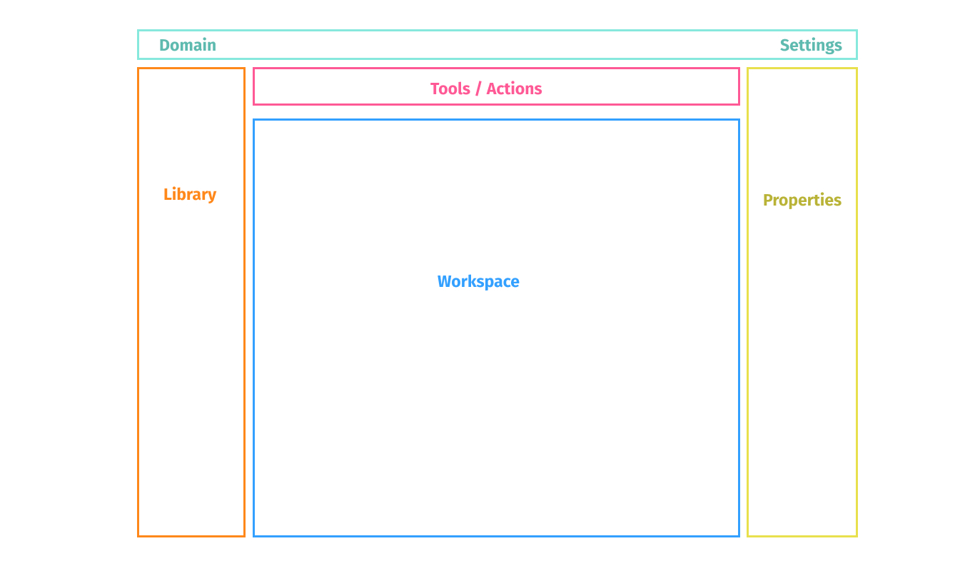
An important thing to mention about this solution is that it behaves as an app and not like a website. Some of the previous apps in Amelia were designed using a ‘page’ paradigm where you need to navigate to different sections to get things done. The problem with this approach is that you need to save your progress before moving to a different page. In this new app, everything happens in the same place. Creating, editing and deleting gets updated in real time. And because now everything is based on the HTML canvas, complex behaviors like drag-and-drop and real time collaboration (and a lot more) are enabled.
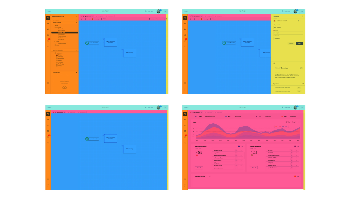
This screen shows the flexibility of this IDE. It optimizes space, hides things that you are not using and can be adapted to multiple applications like a dashboard.
The scope of this case study only scratches the tip of the iceberg of what this redesign represented for the team in terms of work, discussions and continued testing with final users. But it was this the catalyst of important conversations around every important aspect of the app. The final solution included things like in-context documentation, debugging, search and roles.
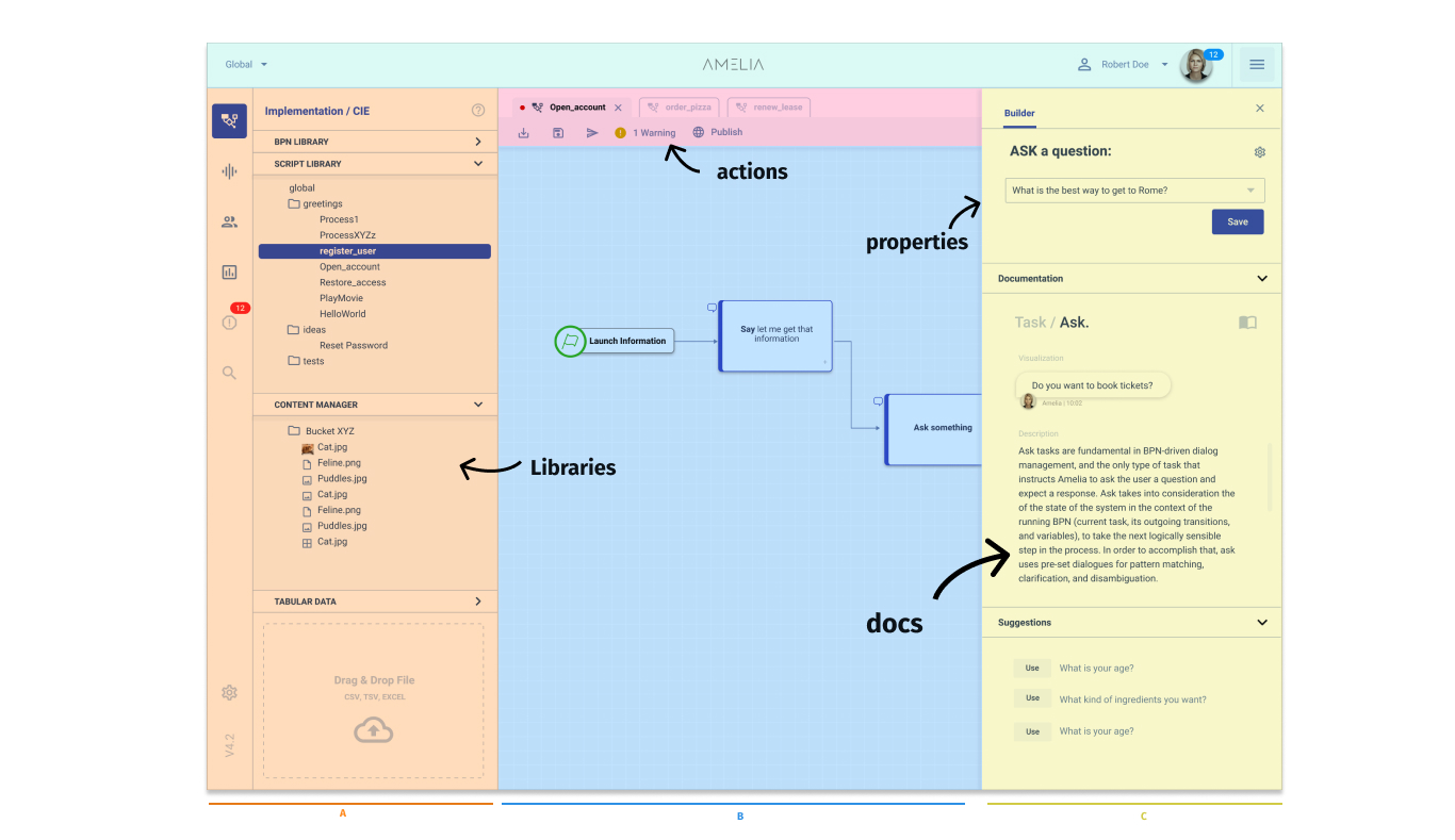
We chose a submodule called BPN to be the first one to be migrated to the new layout, particularly because it was one of the most complicated ones. We then continued with an NLP Debugger, a Conversation Tracker and an Asset Explorer.
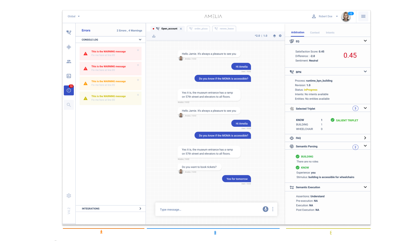
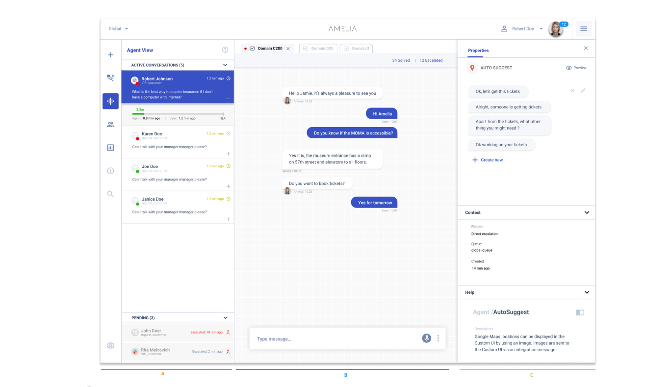
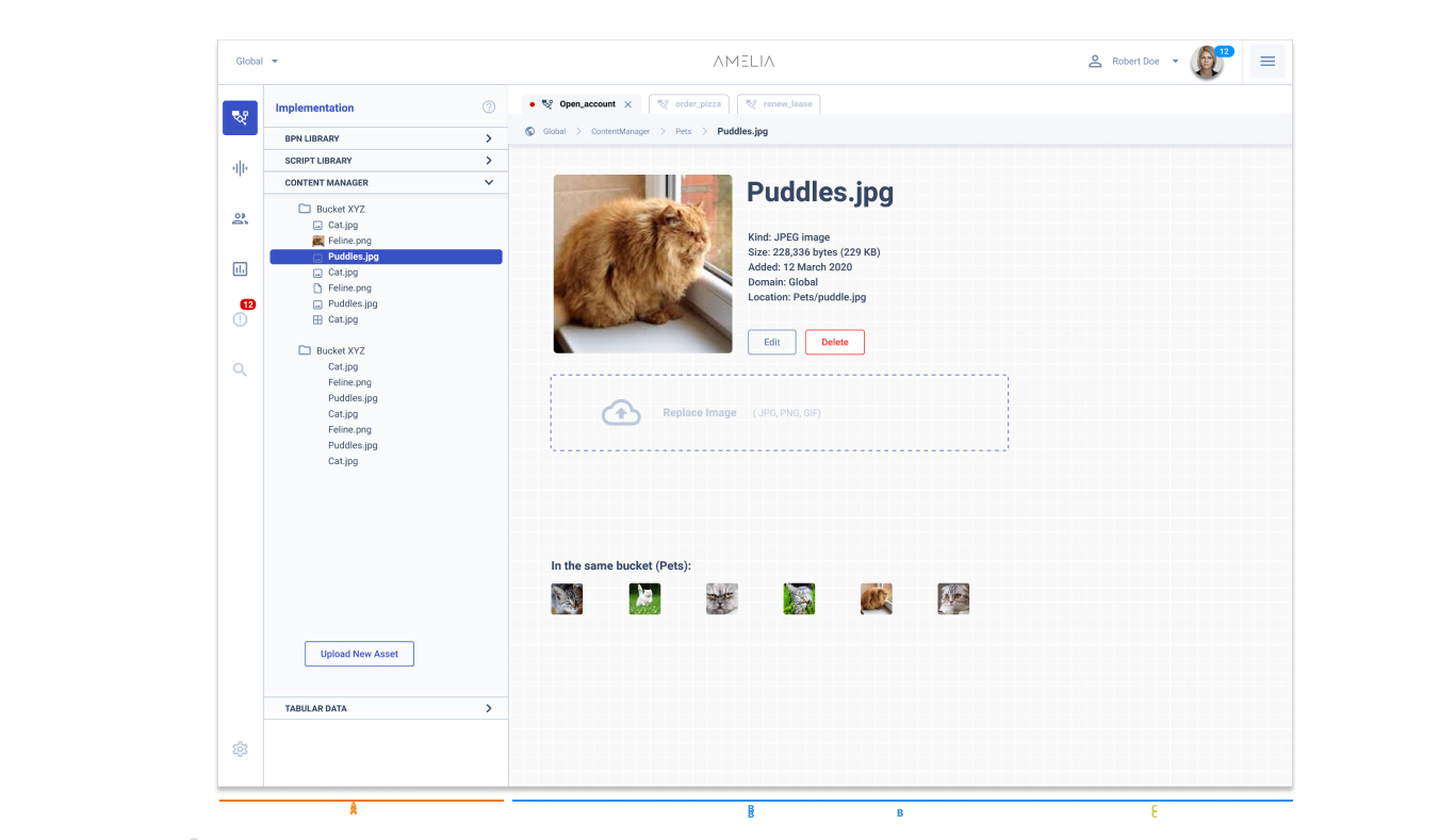
Finally, the layout I’m most proud about was the Search Feature that was capable of searching across all the training data. I’m proud about this because it required minimum changes on the backend supporting it. The design decision to put all the libraries in the same place was the key to making this happen.
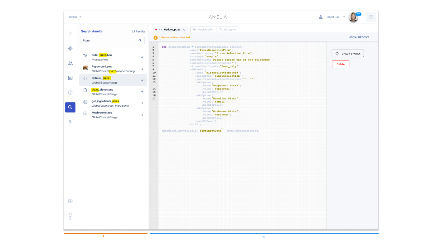
Each one of the previous screens deserve an entire case study, but I’m limiting the scope to the layout redesign.
Results
- Amelia went from 5 to more than 200 enterprise customers in less than 2 years.
- More than 3,000 new users.
- 400% more datasets trained.
- Established design as a pillar of innovation.
Project Learning
- It is crucial to get stakeholders to buy into the project early, especially when it will impact a large part of the business.
- Continuous testing and reliance on data are the best ways to settle two different points of view.
- Any company works in isolation. Company environments are unique and can be insulated. It's a good idea to spend some time exploring their ecosystem and the tools your user is familiar with.