1. The Problem
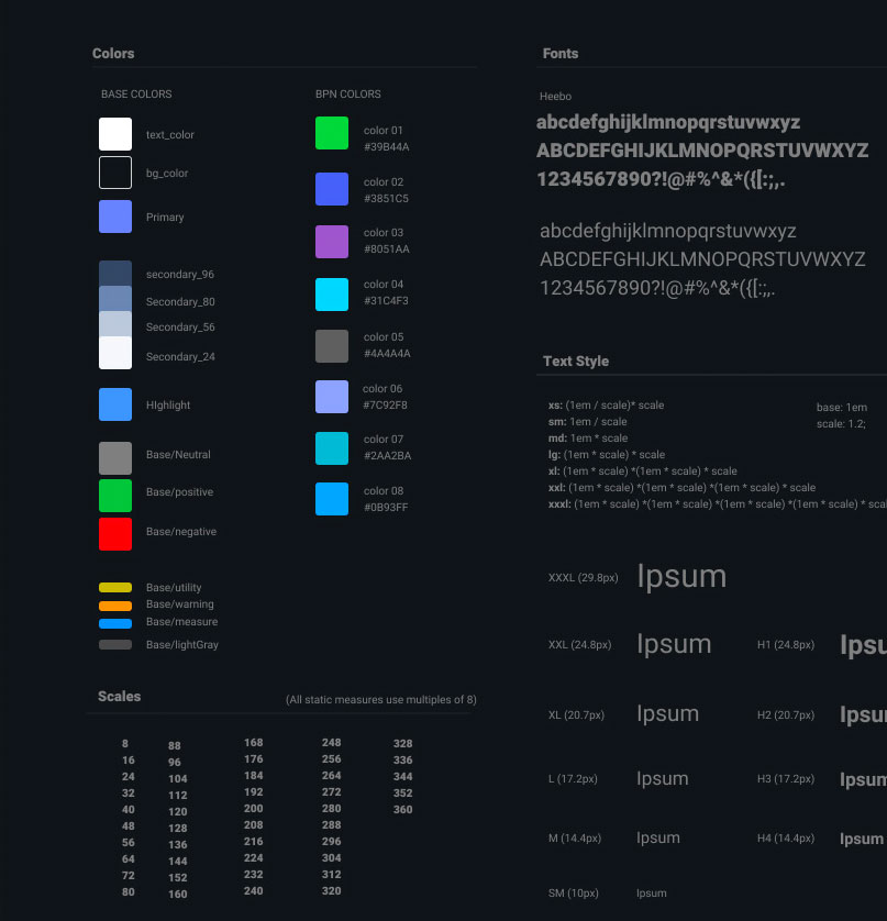
Handoff between designers and engineers is traditionally a complex process that involves the use of multiple apps to accomplish different things (Sketch, Invision, Zeplin, Miro). Fortunately, Figma has solved part of this problem, but the process is still complicated. The engineer in charge of developing the idea still needs to dissect the design and convert all the design decisions into code. And while this is the accepted way of doing things, it is far from being the most efficient one. One of the main reasons is that when design decisions, such as colors, paddings or strokes, are passed to code, they get renamed differently, dropping any reference from the Figma file. This is a problem because it makes it very difficult to map it back to the original file for future use.
Siloed Styles
Another related problem is that once this design decision gets codified in one application (e.g., Dev Console), it cannot be shared with a sister application (e.g., Admin Console). Every application will have an isolated interpretation of each design decision. Any update on a common component (e.g., a button) inside Figma would require a separate update on each application.
A Communication Problem
This is clearly a communication problem that goes both ways. There are no well-established conventions between developers and designers. But the problem is bigger than that: there’s also not a common understanding on how things should work. While the designer can create freely, the developer has to adjust to the limitations of the framework (Material-UI in this case, but the same problem happens with IOS and Android developers).
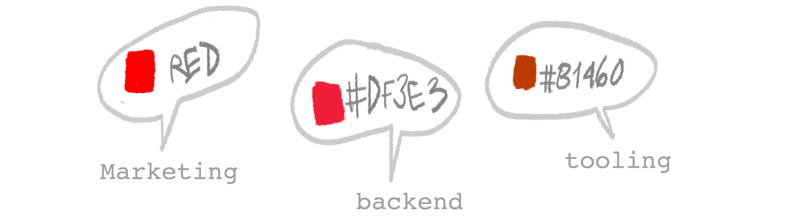
The result of this is that sometimes designs are generated, but do not take into consideration the possibilities and constraints of the technology being used by developers to build the product. Another problem is that the design team inadvertently reinvents features that already exist in Material-UI API.

To mitigate this discrepancy, the engineering team creates a middle layer that maps the design intention with the framework possibilities. In some cases, this is good because it extends what Material-UI can do. But most of the time it duplicates functionality, limits the full potential of the framework, and makes it harder to maintain and scale.
One of the main reasons why the design team tries to generate a different version of the Material-UI base theme is because it is very generic and doesn’t provide Skillz with a unique product personality. This is 100 percent true. However, there are a lot of ways to theme Material-UI to look like a completely different product.
Lack of Visibility
Another reason why designers don’t align better with what the framework can do is because they don’t have visibility of any component until the final product is delivered. They cannot imagine how to build on top of something if they don’t know what it looks like. Related to this, developers cannot show progress to designers until it’s already implemented.
To recap, we have the following problems:
- No clear source of truth for all design decisions.
- No easy way to keep both design and code aligned.
- Generic theming.
- No common understanding of how things work.
- Designers don’t have visibility of coded components.
2. What is Design Token?
In a few words, a design token is a style and naming convention between Figma and code. In Figma it looks like ‘styles’ and in code it looks like ‘variables.’ There are three ways of distributing these tokens: SaSS (manually), JS (versioned), Theme. All of these approaches have pros and cons and can be combined.
Design tokens are the visual design atoms of the design system—specifically, design tokens are named entities that store visual design attributes. They are used in place of hard-coded values, such as hex values for color or pixel values for spacing, to maintain a scalable and consistent visual system for development.
The conventions expressed in the design tokens are the building blocks that the design system uses to create all the basic components (such as buttons, text fields, checkboxes, headers, etc.) and the more complex systems (such as forms, modals, breadcrumbs, login pages, etc.).
Digital assets with Tokens
Any digital asset, like icons, fonts or even an illustration library, can be specified with design tokens. When a group of digital assets becomes too large, it can be transformed into a library. A mature design system normally has a core library for all foundational items, a separated one for icons, and others for brand assets.
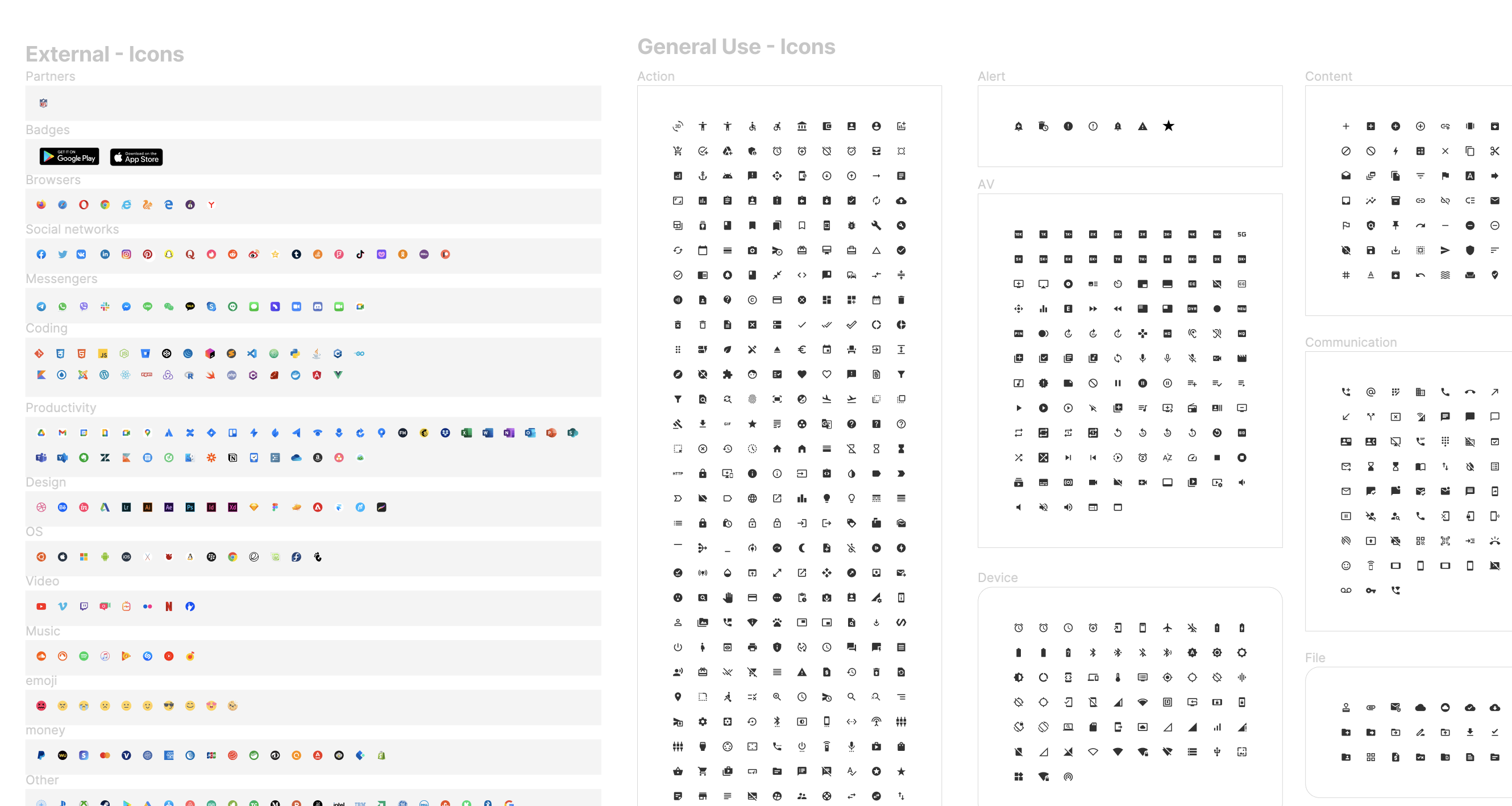
This shows part of the icon library.
Usage in Figma
In Figma, design tokens are defined inside a core library as ‘styles’ or ‘symbols’ and can be used in any Figma doc that uses this library. Normally, a design system would have a core library for brand colors, and other, more specific libraries for specific-use cases.
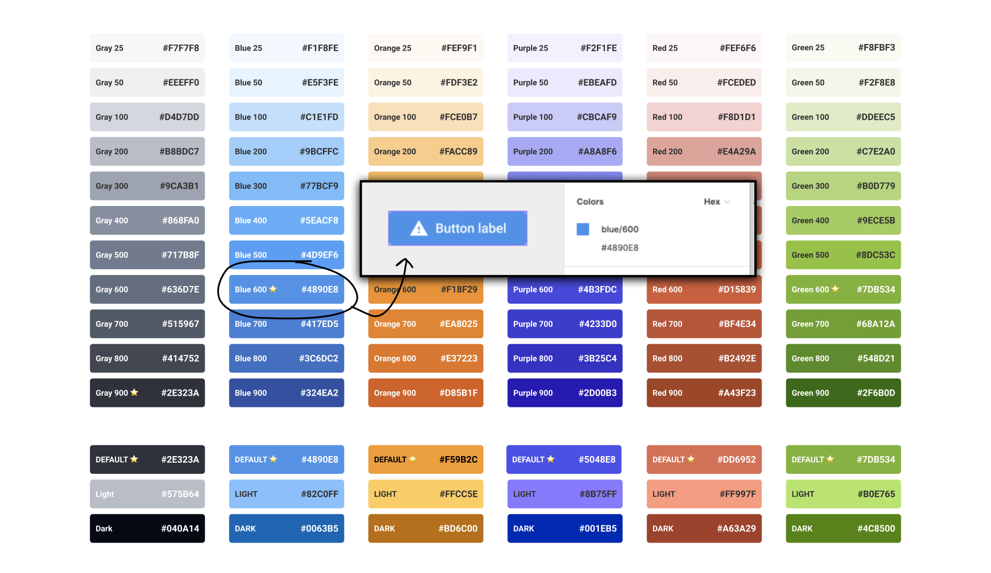
Examples of color ‘design tokens’ inside a library. (A design token can also be used to define fonts, padding, strokes or anything in the design.)
Updating Design Tokens
Once a design system settles on its foundational design decisions (colors, fonts, paddings, etc.), updating design tokens won’t be that common, and that is a good thing. However, if needed, any change will impact all the Figma designs where it was used. This can only be done in the core library directly. Once the changes are published, they will be updated automatically and every file will receive a warning that something has changed. The designer in charge can accept or postpone this change.

This update in Figma won't update the code.
Once Figma is updated, the code also needs to be updated. But this doesn't happen automatically; it needs to be done by a developer reading the Figma file.
Main Points:
- A design token is a minimal design decision such as colors, paddings, font-weight, etc.
- Design tokens can be combined to create a more complex UI (e.g., a button).
- Every digital asset, from icons to fonts, can be specified as a design token.
- In general, design tokens are very stable and don’t change much once they are defined.
Usage in Code
There are three ways to use design tokens in the code. The first way is to manually update the values into the stylesheet (e.g. Sass). The second way is to include them via a Theme and the third is to receive them as a Global Variable (NPM) . Every approach has pros and cons. The first way is the simplest to implement, while the third way is the most complicated but with more potential. The three approaches can be used in combination at the beginning for an easy transition, but ideally we should settle for one that allows sharing them across multiple applications.
Tokens can be implemented as:
- 2.2.1 Sass
- 2.2.2 Theme
- 2.2.3 Global Variables (via NPM)
Tokens as Sass
Sass is a preprocessor scripting language that is interpreted or compiled into CSS and is currently one of the most popular ways of assembling complex styling sheets for web projects.
✅ Pros:
- Sass allows developers to define values as variables and use them in different places. This approach naturally fits with design tokens because you can replicate the libraries created in Figma as Sass variables.
❌ Cons:
- Sass variables are not compatible with Javascript; this means that they cannot be used outside a Sass context or directly in the React code.
- Sass variable sheets inside a repository cannot be shared with other projects.
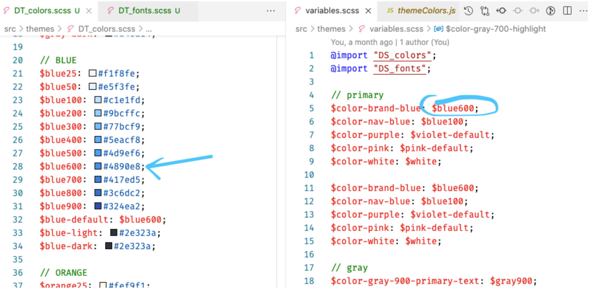
This shows the tokens implemented as Sass variables.
Tokens as a Theme
MUI Themes system is a well-thought framework that allows general and granular theme customization. It allows developers to specify global styles such as Primary, Secondary color and fonts, but also allows for the customization of specific components.
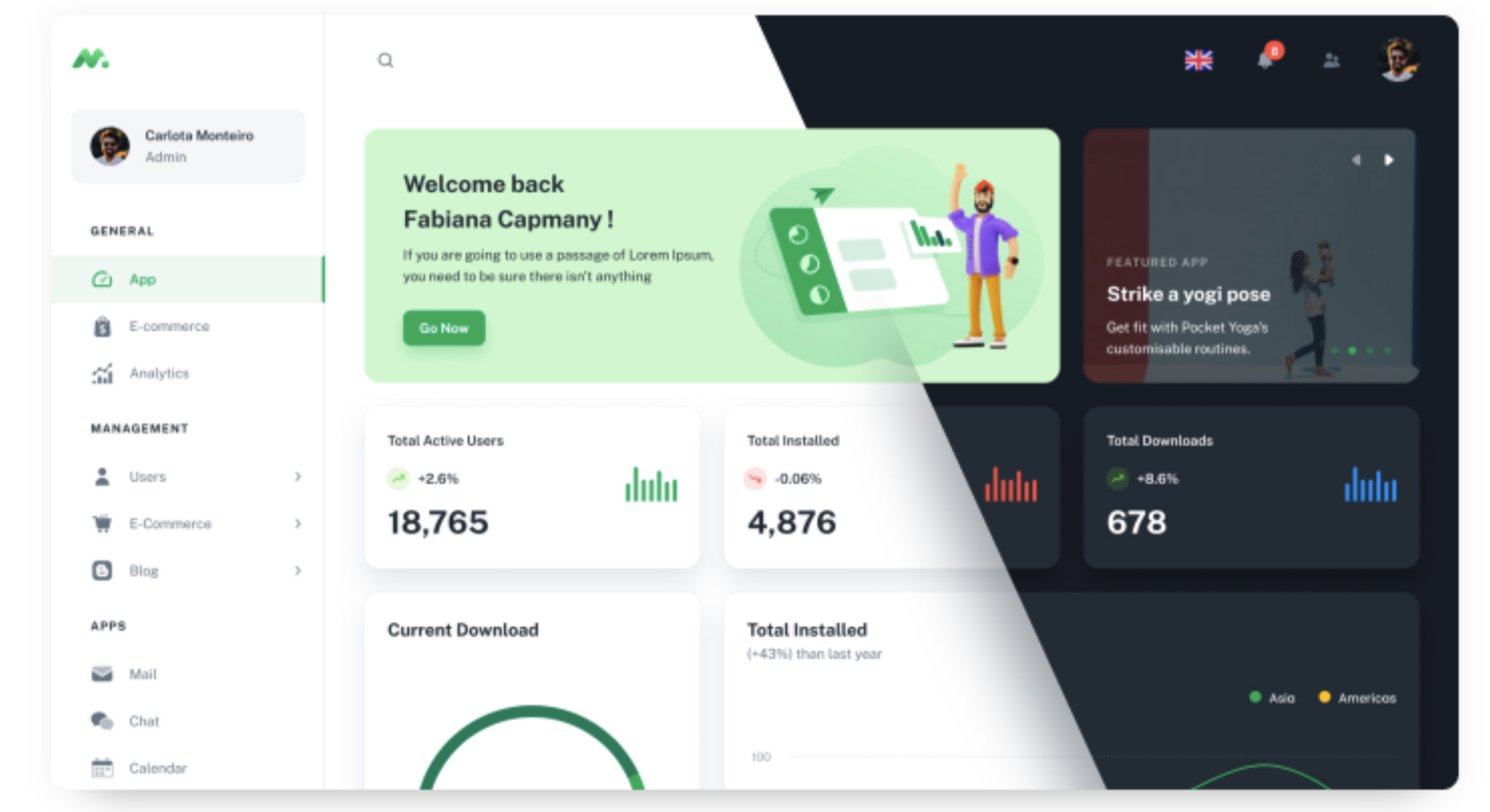
Tokens can be implemented as part of a theme before styles get compiled.
A theme is a JSON object that specify only the overwrites of the base theme and it looks something like this:
    export const themeOptions: ThemeOptions = {
      palette: {
        type: 'dark',
        primary: {
          main: '#ff8f00',
        },
        secondary: {
          main: '#f50057',
        },
        background: {
          default: '#310000',
          paper: '#731010',
        },
      },
      typography: {
        fontFamily: 'Do Hyeon',
      },
      shape: {
        borderRadius: 16,
      },
    };
✅ Pros:
- Can be pre-compiled before submitting to code.
- Can work with existing Theme systems (not automatically; some work needs to be done).
❌ Cons:
- Is limited to one type of theme. If the developers want to take this to another framework such as Angular, Joomla, etc., a completely new theme needs to be generated.
- Cannot be versioned because the developer compiles it locally.
Tokens as NPM
NPM is a way to distribute code packages to different applications. It’s normally used for components, but can be also used to distribute design tokens as global variables. All JS script web technologies, including React and React Native, use NPM as their main package administrator making it very easy to implement .
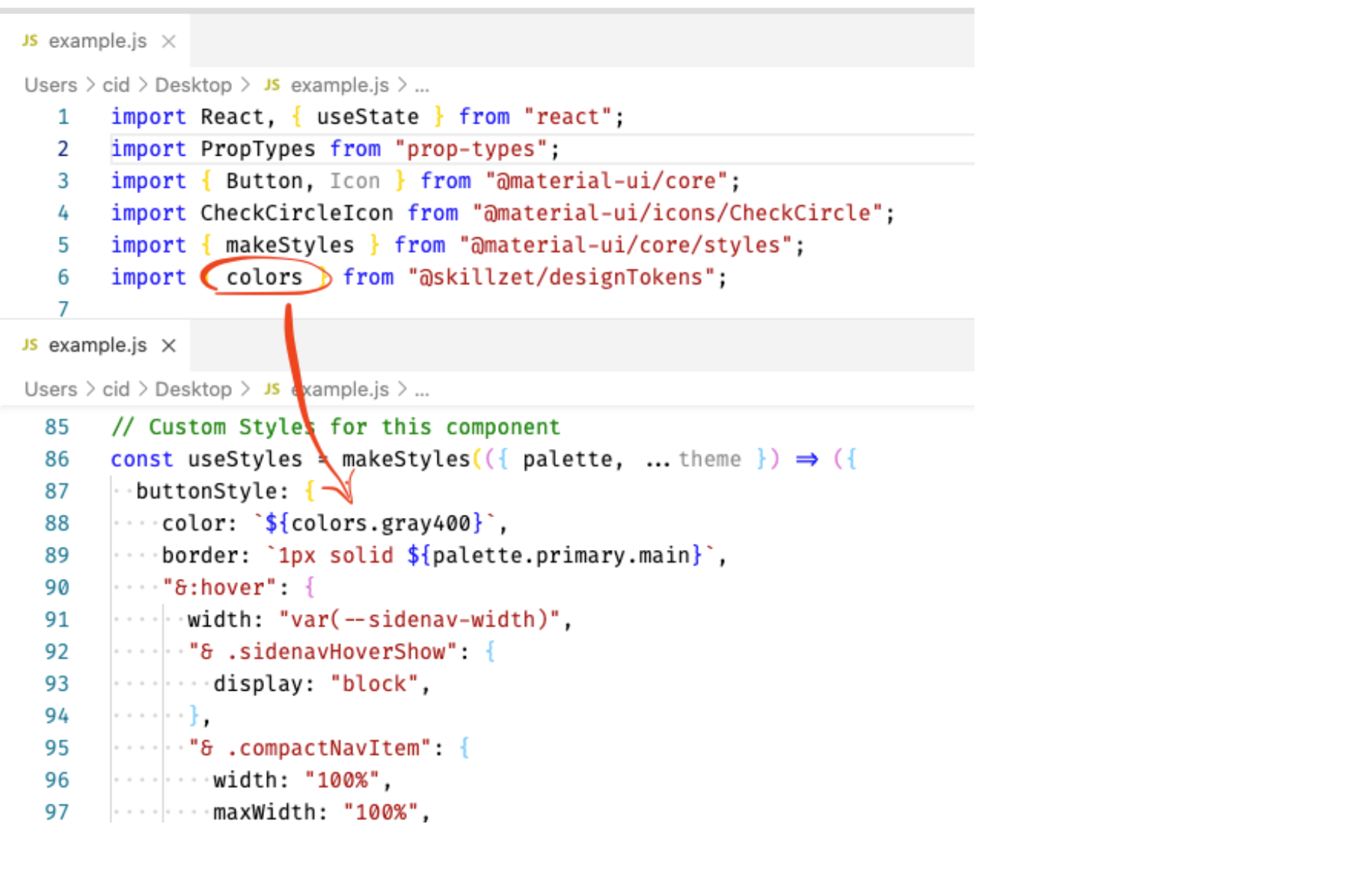
This shows how a color can be assigned using a Node package
✅ Pros:
- The main advantage of using NPM for design tokens is that there’s no limit to the number of applications that can use them. - They can also be versioned, which means that tokens won’t break any code automatically when they get updated. - Design tokens as NPM can be used in any React Javascript directly as variables. - They can be integrated into Storybook.
❌ Cons:
- Very technical, cannot be implemented by designers only.
Working Example
I prepared a working example in NPM: it only uses colors, but the basic structure is the same. It can be downloaded here
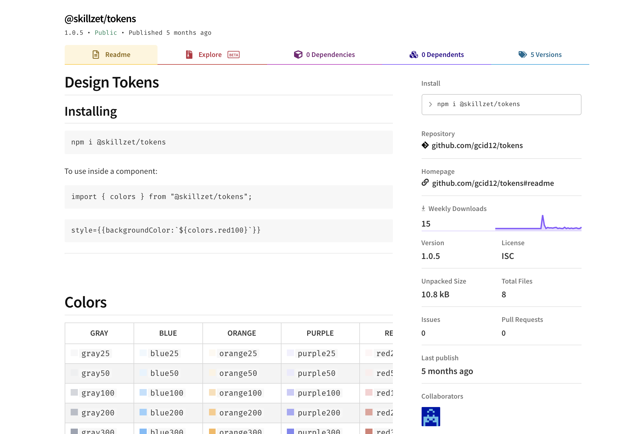
With NPM, you can use the same design tokens across different applications.
3. What is Storybook?
Storybook is an open source tool for building UI components and pages in isolation. It streamlines UI development, testing and documentation.
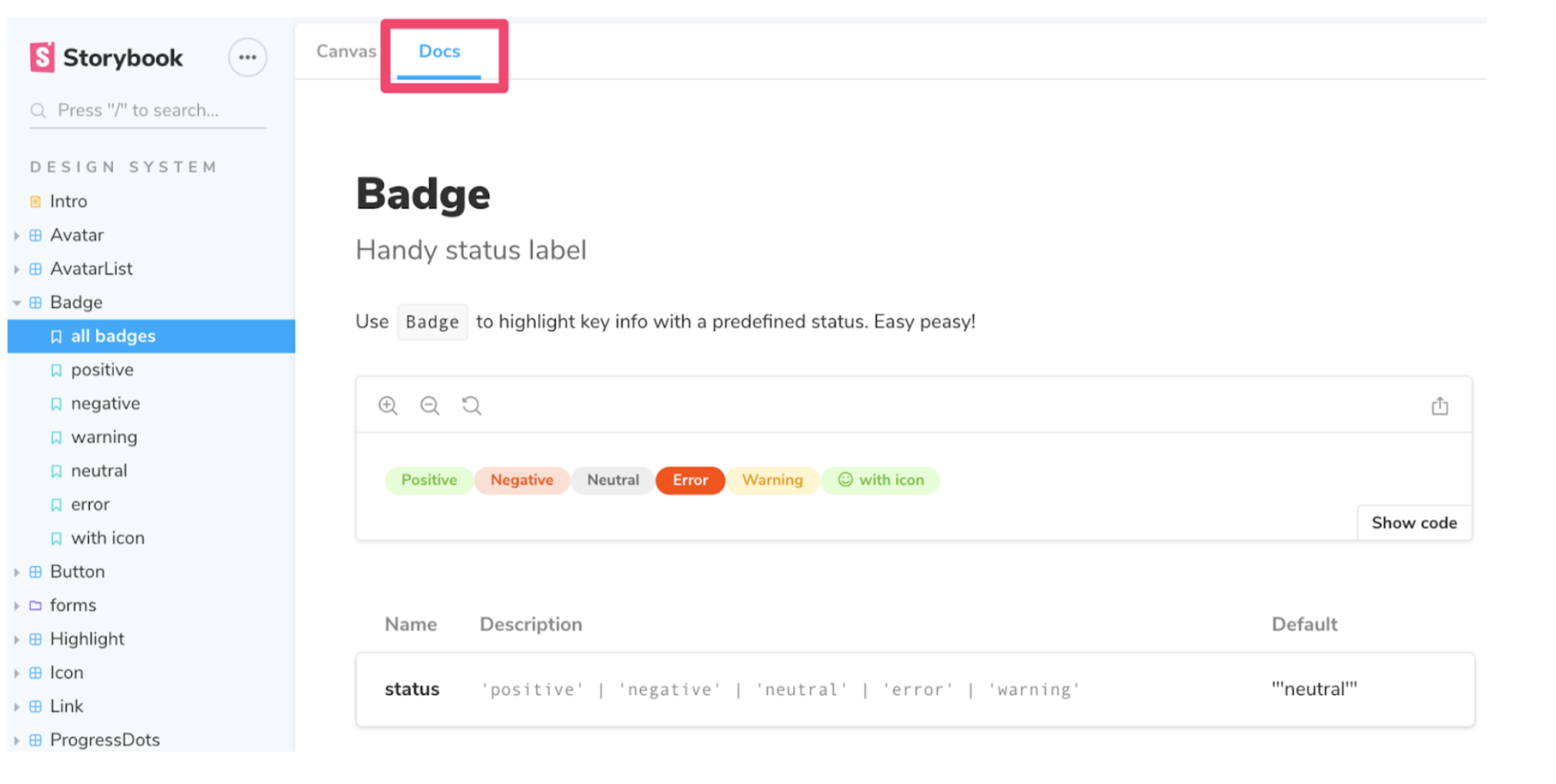
Storybook is an open source project that can be installed in any JS-based frontend.
Development
The tool enables developers to create components independently and showcase components interactively, in an isolated development environment. Storybook runs outside of the main app so users can develop UI components in isolation without worrying about app-specific dependencies and requirements.
Benefits:
- Increases team awareness of existing components (no more reinventing the wheel). - Serves as a living guide and documentation. - Makes it easy to visually test edge cases.
Testing
Storybook is also great for catching bugs and regressions in the UI components. All common UI tests such as unit testing, visual regression tests and snapshot tests can be implemented. More info https://storybook.js.org/docs/react/workflows/testing-with-storybook
Design
Storybook is the perfect place for collaboration between designers and developers because it allows developers to show work in progress, or receive feedback on isolated parts of the app, before the entire page or dashboard is finished. It also provides a safe environment for experimentation.
Figma and Storybook
Figma and Storybook/React don’t have a direct way to connect to each other; for this we rely precisely on design tokens. Tokens are design decisions encapsulated in the form of variables that can be distributed to React in three different ways: Manually (using Sass), Automatically (using NPM) or as a Theme (MUI).
4. Conclusions
By improving the tokens communication between designers and engineers, we improve the handoff of the final design.
Design tokens improve the way design decisions are made and communicated to developers. There are multiple ways to implement the tokens and they can be achieved with minimum or no-code refactoring. It reduces the amount of initial work necessary for new projects and enables scalability (using it in future Skillz apps).

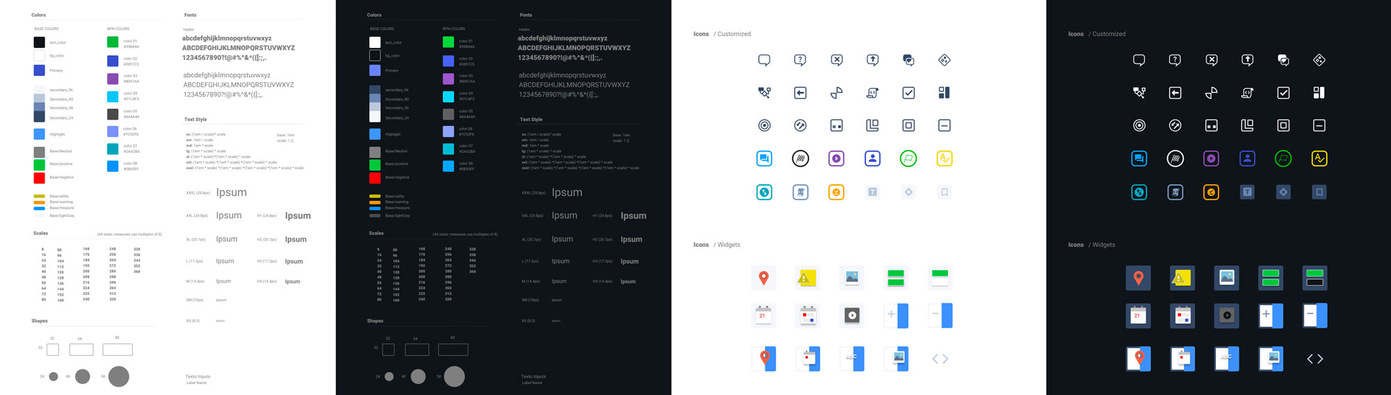
Any design decision can be codified into design tokens.
But in order to make all this work, the relationship between developers and designers needs to evolve. And this means that both sides need to be aware of and understand the constraints, limitations and possibilities of the other.
On one hand, designers need to become more technical and study the framework used by the developers to design accordingly. This doesn’t mean that they need to be limited, but rather the opposite. By understanding the tech behind the app, the designer can imagine new possibilities and come up with new ideas.
On the other hand, engineers need to open the door to designers and trust them to make the right decision on things, like naming the design tokens, choosing a layout that makes sense and, if possible, even allowing them to write stories in Storybook.
After implementing Design Tokens